A Cozy Winter Color Palette Without Holiday Colors

Winter decorating doesn’t have to revolve around evergreen branches, red accents, or anything that feels tied to the holidays. If you enjoy the quieter side of winter, the calm, the layers, the slower pace, this color palette was created with that feeling in mind.
I’ve been thinking about winter in a cooler, more relaxed way. Instead of the usual seasonal colors, I wanted something that felt soft, grounded, and easy to live with throughout the entire winter season.
I named this palette Betty Winter, a name I came up with to reflect the calm, grounded feeling I wanted this color mix to have throughout the season.
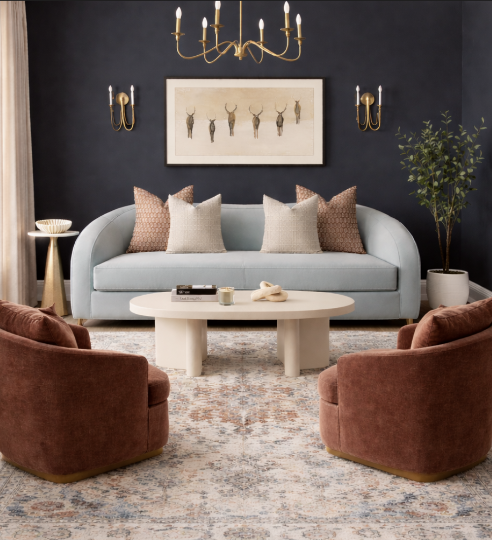
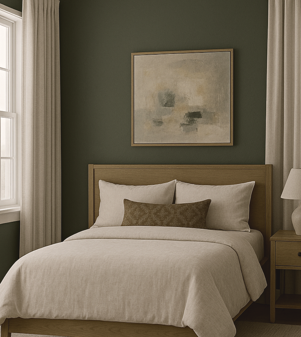
The Betty Winter Color Palette
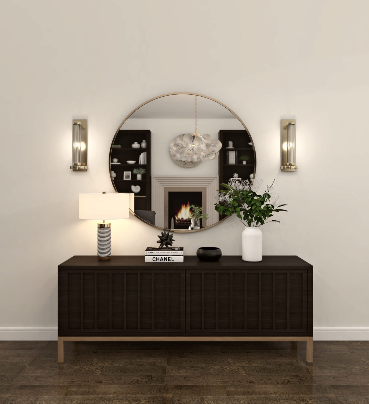
This palette is built around balance. Deep navy brings structure and depth, while muted light blue softens the overall feel and adds a quiet winter mood without feeling cold. Warm camel and cognac tones introduce comfort and familiarity, keeping the palette from leaning too cool. Creamy neutrals and beige help everything breathe, preventing the space from feeling heavy or dark. Subtle brass accents finish the look, adding warmth and a quiet sense of refinement.
Together, these colors feel layered, comfortable, and intentionally understated.

The Color Story Behind Betty Winter
The Betty Winter palette is inspired by the quieter side of the season, the moments when winter feels soft rather than stark. Think overcast afternoons, textured layers, and spaces that feel warm without relying on obvious seasonal cues.
The palette moves between cool and warm in a way that feels natural, not forced. Cooler hues set a calm, steady backdrop, while warmer tones appear in smaller, more tactile ways, through upholstery, wood finishes, and subtle details you notice as you spend time in the room. Lighter neutrals act as a visual pause, giving the eye a place to rest and allowing each color to stand on its own without competing.
Nothing in this palette is meant to shout. Instead, it’s about quiet contrast and softness, colors that feel familiar, slightly weathered, and easy to live with. The overall effect is cozy, grounded, and timeless, offering a winter mood that feels elevated and effortless rather than themed or traditional.

Why This Works for Winter Without Feeling Seasonal
Rather than relying on high contrast or bold seasonal color shifts, this palette is driven by tone and texture. Navy provides depth without the heaviness of black, while muted blue reflects winter light in a softer, more relaxed way. Camel and cognac introduce warmth, and lighter neutrals keep the overall feel open and livable.
Because the palette avoids obvious seasonal references, it works throughout winter and transitions easily into the months that follow.
How to Use This Palette at Home
In living rooms, navy works beautifully as an anchor, whether on walls, sofas, or large upholstered pieces. Muted blue adds softness through seating or accent textiles, while camel and cognac bring warmth through chairs, pillows, or leather details. Creamy neutrals help tie everything together and keep the space feeling balanced.
For bedrooms, this palette feels especially calming. Navy or beige walls paired with soft blue bedding create a restful base, while warm accents in camel or cognac add comfort. Brass lighting or hardware subtly elevates the room without overpowering it.
In smaller spaces, lighter walls keep things open, while navy and muted blue can be introduced through furniture or decor. Warm textures do the heavy lifting here, adding depth without crowding the space.

Let Texture Do the Work
What truly gives this palette its cozy winter feel isn’t just color, it’s material choice. Soft fabrics, smooth stone or marble, woven textiles, and warm metallic finishes all play a role. These layers create interest and warmth without relying on bold color shifts.
Texture allows the palette to feel rich and inviting while staying calm and neutral.
A Winter Palette You Can Live With
Betty Winter is designed to feel easy and adaptable. It works throughout the winter months and transitions naturally into early spring with minimal changes. By focusing on balance and layering, this palette creates a space that feels calm, grounded, and comfortable, without leaning into traditional holiday colors.
Want to bring this room to life in your own home?
(Click image to shop the look)

I hope you enjoyed it!
keysi