Stone Bloom: A Grounded Color Story

This palette grew out of a search for winter color that felt lasting, layered, and intentional, without relying on holiday cues. I love decorating for winter, but I don’t always want spaces that lean into reds, greens, or anything that feels tied to a specific moment on the calendar.
That exploration first led me to create Betty Winter, a palette focused on softness, balance, and warmth through tone and texture. As I continued working with that idea, I found myself drawn to something slightly deeper, more grounded, more architectural, and built around contrast rather than lightness.
That’s where Stone Bloom comes in.
Stone Bloom is a winter palette that leans into depth and material rather than theme. It’s about structure softened by warmth, and contrast that feels natural instead of dramatic.
The Color Story Behind Stone Bloom
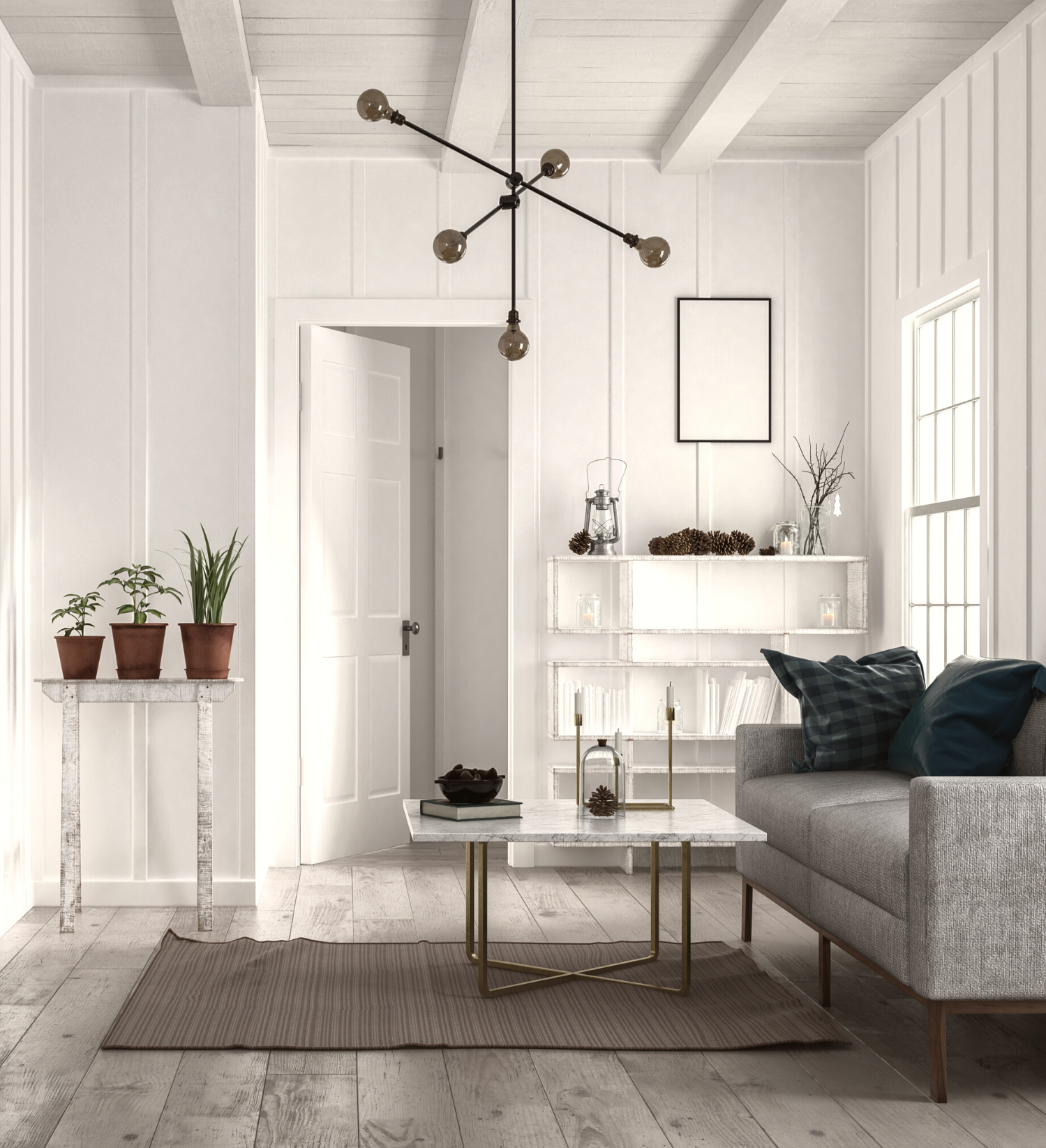
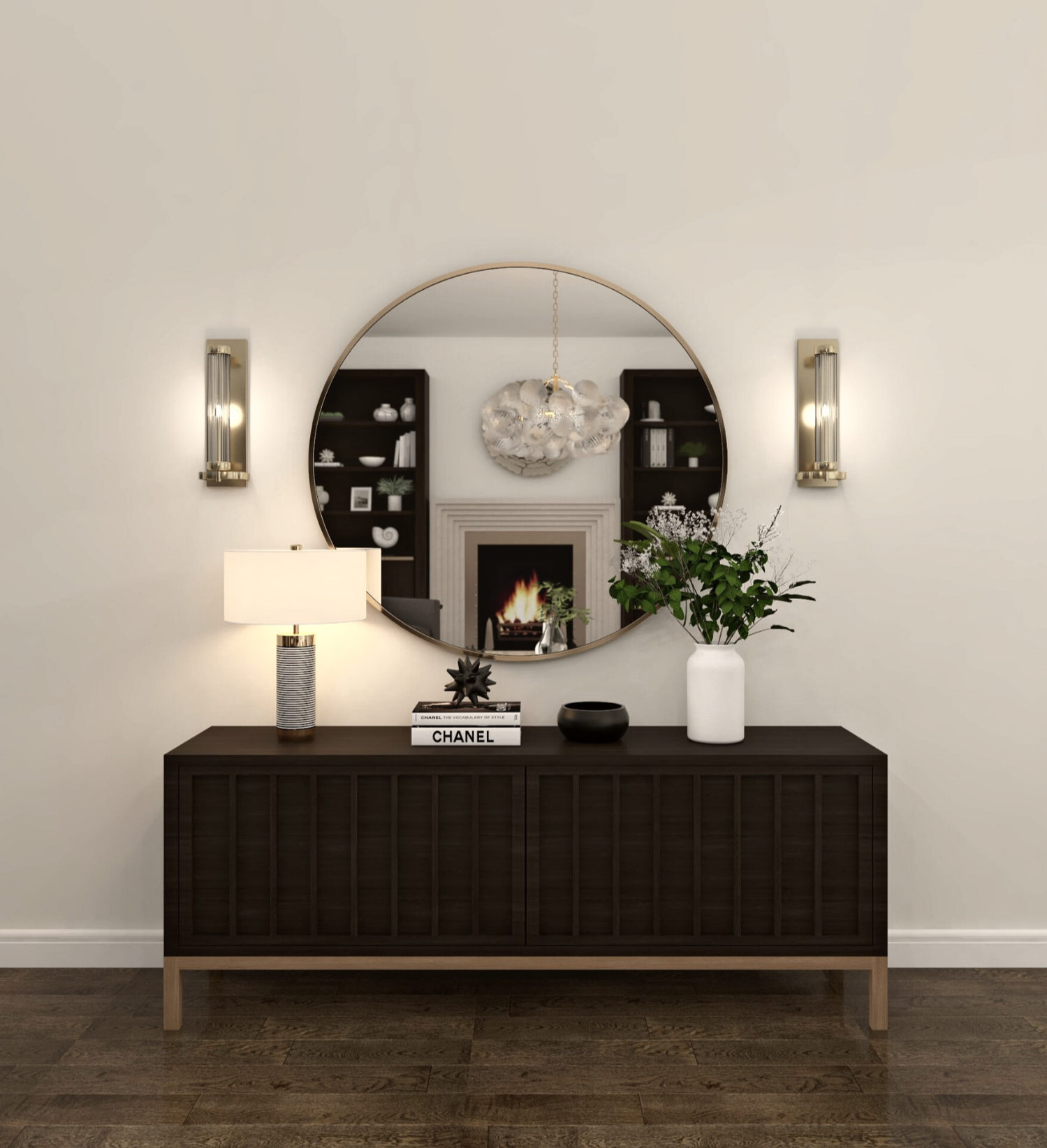
Stone Bloom takes inspiration from materials that age well over time, stone, plaster, worn textiles, and softened finishes. The palette is anchored in charcoal and warm gray tones, which give the space weight and stability without feeling heavy or closed in.
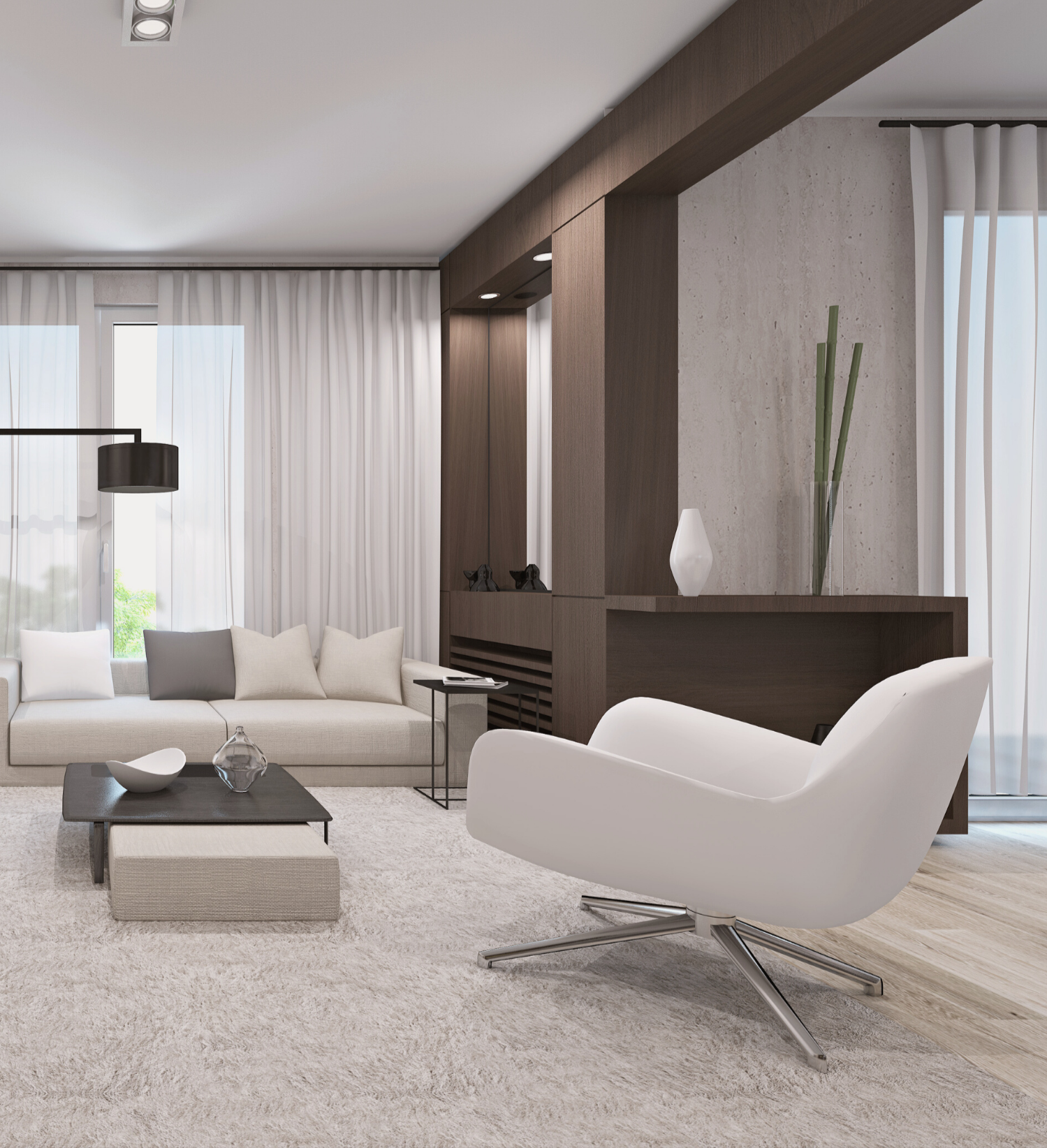
Lighter neutrals play an important supporting role. They create balance and breathing room, allowing the deeper tones to feel intentional rather than overwhelming. These lighter shades are not meant to stand out on their own, but to support the palette as a whole.
Muted mauve appears subtly, adding warmth and softness in a restrained way. It’s used through upholstery and accents rather than large surfaces, bringing contrast without shifting the palette toward anything overly feminine or decorative.
What defines Stone Bloom isn’t one color in isolation, but how each tone works in relation to the others. The palette is built on proportion, texture, and layering rather than bold contrast.

Why Stone Bloom Works for Winter Without Feeling Seasonal
Instead of relying on traditional winter colors or high contrast, Stone Bloom focuses on tonal depth. Charcoal replaces black for a softer, more livable foundation. Warm grays and stone-inspired neutrals keep the space grounded while still feeling open.
The mauve tones add warmth in a way that feels modern and understated, and the lighter neutrals reflect winter light without brightening the space too much. Because the palette avoids obvious seasonal references, it works throughout winter and transitions naturally into the months that follow.
Stone Bloom is winter-inspired, not winter-themed.

How to Use This Palette at Home
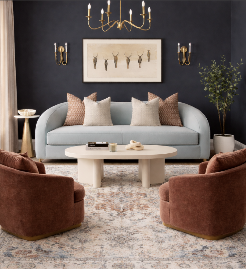
In living rooms, charcoal or deep gray walls create a strong foundation, especially when paired with architectural details like paneling or millwork. A soft neutral sofa keeps the room balanced, while accent chairs in muted mauve or warm gray introduce contrast and depth. Mixing accent chair styles works especially well with this palette, helping the space feel collected rather than coordinated.
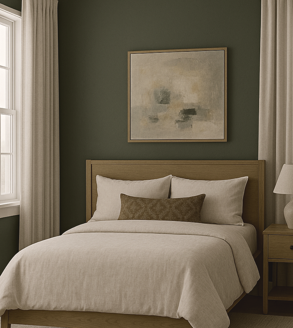
In bedrooms, Stone Bloom feels grounded and calming. Warm gray or charcoal walls paired with creamy bedding create a composed base. Mauve works beautifully in upholstered headboards, benches, or throw pillows, adding softness without becoming the focal point. Warm metallic finishes subtly elevate the space without overpowering the palette.
In smaller rooms, lighter wall colors keep things open while darker tones appear through furniture, rugs, or artwork. Texture does most of the work here—layered fabrics, woven materials, and subtle finish variations add depth without visual clutter.

The Overall Feel
Stone Bloom is about balance and restraint. It’s grounded without feeling heavy, layered without feeling busy, and elevated without feeling formal. This palette is designed for spaces that feel intentional and lived-in, where contrast comes from material and proportion rather than bold color shifts.
It’s a continuation of my exploration into winter color beyond the holidays, building on the ideas behind Betty Winter, while offering a deeper, more grounded option for those drawn to moody, composed interiors.
Want to bring this room to life in your own home?
(Click image to shop the look)

I hope you enjoyed it!
keysi